On Friday the Bureau of Labor Statistics released their first preliminary estimates for May 2020 industry-specific employment. The numbers provide a snapshot of what happened to the U.S. job market in the second full month of the United States COVID-19 epidemic. I share some highlights with original graphs and charts.
Introduction
On Friday morning the Bureau of Labor Statistics released preliminary (emphasis on preliminary) United States total employment numbers for May 2020, along with expanded and updated numbers for April 2020 (which are also still preliminary). The data shows some slight improvements in the abysmal job situation of April 2020; a month in which approximately 20 million jobs were lost across 94% of all low-level industries tracked by the BLS.
The losses in April of 2020 were so bad that a total of 13% of all jobs in the United States dissolved. Still, the first-release preliminary data for May 2020 shows the overall economy regaining 15% of the April jobs losses, with the biggest on-paper recoveries occurring in an eclectic set of businesses:
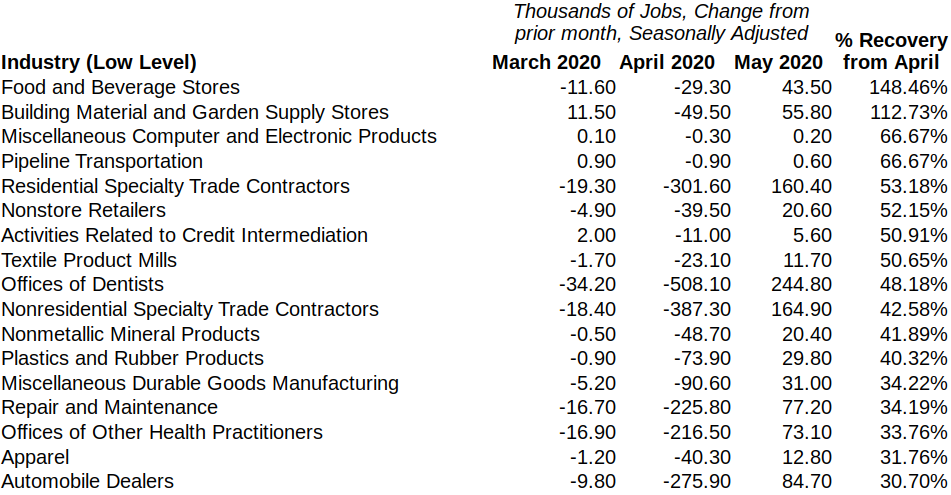
Not all these signs of recovery are as impressive as they appear—Food and Beverage Stores, for example, barely registered an employment change in April, with a less than 1% drop, so it’s “rebound” is not especially notable:

For other industries the May 2020 employment “bounce” appeared to be much more meaningful, such as in Dental Offices employment, which is shown in Part 3 of this analysis.
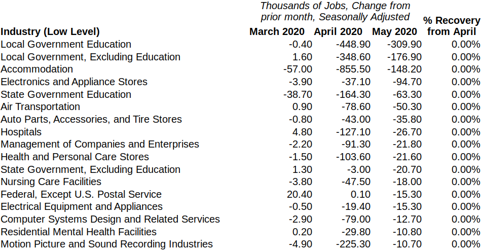
Along with the low-level industries captured in the table above, the BLS CE data for May showed an additional 57 other low-level industries posting on-paper job recoveries, including in the deeply troubled ‘Food Services and Drinking Places’ industry. Despite these single-month gains, many industries continued their decrease in employment, including growing (albeit decelerated) employment drops in the industries of ‘Hospitals’, ‘Motion Picture and Sound Recording Industries’, and ‘Local Government’:
With the world still technically in the early phases of the pandemic, and with COVID-19 still raging in the United States, it’s unclear how meaningful or lasting this bump in jobs will be. Regardless, the BLS employment numbers give us one early metric for understanding what the new coronavirus is doing to the economy, and it allows us to track where the chips are falling.
My overall survey of the preliminary May 2020 employment data is divided into four parts, and has a decidedly “Western” theme:
1. The Good – Industries with stable April and May employment gains
2. The Bad – Industries with accelerating Spring job losses
3. The Ugly – Industries with the most volatile Spring employment numbers
4. The Awful – Industries with the highest percentage employment drops in April and May
UP NEXT: The Good